Case study
Capo
A Chrome extension that lets musicians move a song into their own key and slow it down, while it plays in the tab they already have open.
Project details
- Role
- Frontend engineering · Interface design · Release
- Team
- Frontend engineer on the Capo team, Elyra Lab
- Timeline
- 2025 — present, actively maintained
- Platform
- Chrome extension, Manifest V3
- Stack
- TypeScript · React 19 · WXT · Tailwind CSS · Web Audio
- Status
- Shipped on the Chrome Web Store
Chapter 01
The product
Capo is a Chrome extension for musicians. It sits on the toolbar, and when there is audio or video playing in the tab it lets you transpose that audio into a different key, slow it down, adjust the volume, and loop a section — without downloading the track, opening another application, or leaving the page.
It works on media the page itself owns: a video on YouTube, a track on a streaming site, an audio element on a teacher’s lesson page. The extension does not host or fetch anything; it changes what comes out of the speakers for audio the browser is already playing.
It is published on the Chrome Web Store, has been through a long run of updates since launch, and is the product I currently work on full time.
Chapter 02
Who it is for, and the problem
The user is someone learning a song by ear or playing along with a recording — a guitarist, a singer, a pianist. Two things get in their way, and both are pitch-and-time problems the browser does not solve.
- The song is in the wrong key. A vocalist cannot reach it. A guitarist would need a capo on the fourth fret and a rewrite of every shape. The recording is fixed; the player is not.
- The song is too fast to learn from. The passage you need is four bars long and goes past at full tempo. You need it at 70%, and you need those same four bars again immediately.
The existing answer was to leave the browser: download the audio, open a desktop editor, set up a project. That is a fine workflow for producing music and a terrible one for practicing it, because the cost of starting is higher than the thing you were about to practice. Capo’s premise is that the adjustment should happen where the song already is.
The design constraint that shaped everything else: a musician has an instrument in their hands. Anything that takes more than one glance and one gesture will not get used.
Chapter 03
My role
I am a frontend engineer on the Capo team at Elyra Lab. What I own is the practice interface — the controls a musician actually touches, the states around them, and the frontend that connects those controls to the audio path. I write the interfaces, the tests that cover them, and I follow that work through review, release, and the maintenance after it.
The decisions described here are the frontend and interaction ones, which are the ones I can speak to honestly. Where a choice was the team’s, it is described as the team’s.
Chapter 04
The controls
The main surface is a popup 300 pixels wide. That is a hard constraint — Chrome decides the canvas, not me — and it turned out to be the most useful design input in the project, because it makes hierarchy non-negotiable. There is no room to give two controls equal weight, so the interface has to state what matters.
Pitch matters most, so pitch is a dial and it is the largest object on the screen. It reads in semitones, because that is the unit a musician thinks in — not a percentage, not a frequency ratio. Whole semitones move with the − and + buttons or the dial; a separate fine slider handles cents for matching a recording that was not tuned to concert pitch. Speed and volume are horizontal faders with a detented center, so returning to 100% is a gesture rather than a target you have to hit. The transport and the A/B loop sit at the bottom, where they stay reachable while everything above scrolls.
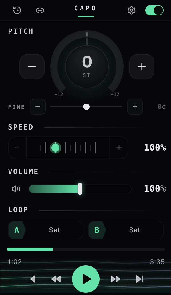
Every readout is a live value, not a label. The dial shows the number of semitones, the fine slider shows cents, speed shows a percentage, and the badge on the toolbar icon shows the current transposition — so you can tell at a glance from another tab whether Capo is doing something to your audio. Nothing about the current state is hidden behind a hover.
Chapter 05
Getting inside a page you don’t own
This is the part of the project that is genuinely hard, and it is not the audio math — it is the browser.
To change the pitch of audio a page is playing, the extension has to insert itself into that page’s audio graph. Manifest V3 makes that awkward on purpose. A content script in the isolated world can call extension APIs but cannot touch the page’s JavaScript globals. A content script in the main world can touch the page’s globals — which is the only way to intercept an AudioContext — but cannot call extension APIs. Capo needs both halves, so it runs both scripts, at document start, in every frame.
Popup
React · extension page
The controls. Reads current state, sends the user’s intent.
setPitchBackground service worker
MV3 · event-driven
Holds per-tab state and keeps the toolbar badge honest.
pitchCommandContent bridge
Isolated world · every frame
Can call extension APIs. Cannot see the page’s globals.
CustomEvent bridgePitch engine
Main world · every frame
Can see the page’s globals. Patches AudioContext and owns the graph.
AudioParamAudioWorklet processor
Audio thread
Where the sound actually changes, on the way to the speakers.
The main-world script patches the page’s audio constructors before the page has a chance to use them, so any media element or audio graph the page creates is routed through an AudioWorklet processor on its way to the speakers. Pitch is written to a worklet parameter as a ratio derived from semitones and cents; playback speed uses the media element’s own playbackRate, because the browser already does that well and doing it twice is worse than doing it once.
The decision I would defend hardest is what happens when you turn Capo off. The obvious implementation is a flag inside the processor that makes it pass audio through untouched. Instead, turning Capo off rewires the graph so the processor is no longer in the path at all. It costs more code, and it means the off state is genuinely off — no processing, no risk of coloring someone’s audio while they are not using the extension.
The other constraint is frames. Most media on the web plays inside an iframe, so both scripts run in every frame, each frame reports what it can see over its own port, and the popup aggregates those reports and picks the media it should be controlling. A single-page navigation — the kind YouTube does without reloading anything — has to be noticed and handled as a new track, because from the browser’s point of view nothing happened.
Chapter 06
Interface decisions
Four decisions did more for the product than any feature did.
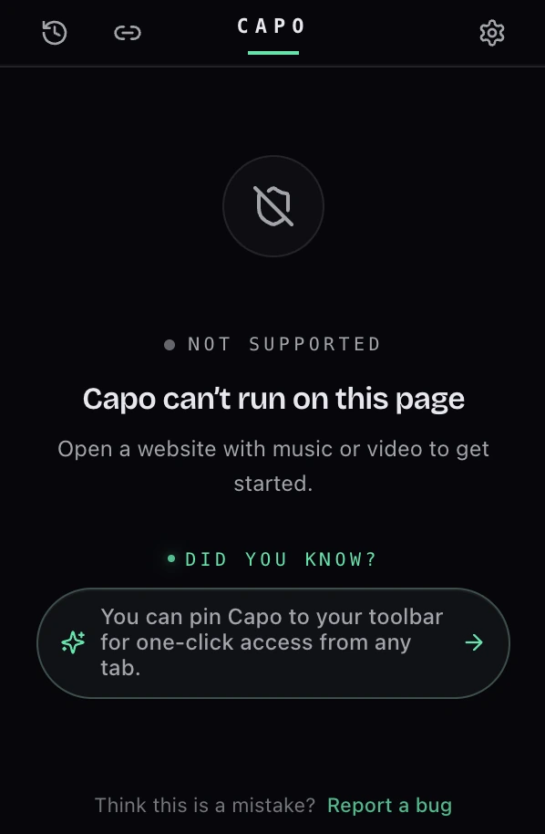
States are designed, not defaulted. An extension that depends on the current tab is wrong most of the time — most pages have no audio. Opening Capo on a page it cannot work with gives you a clear statement of what happened and something to do next, rather than a panel of dead controls that leaves you wondering whether the extension is broken.
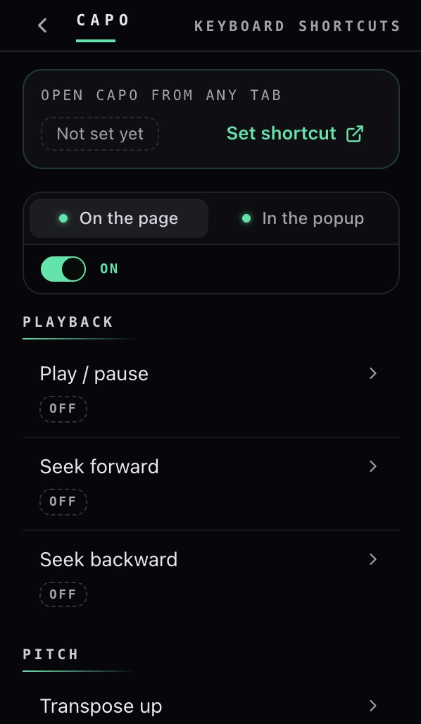
Nothing depends on the popup being open. Practicing means your hands are busy, and the popup closes the moment you click back into the page. So the controls that matter during playback are also keyboard shortcuts: remappable, and scoped so you can choose whether a key works everywhere on the page or only inside Capo — because a musician who plays along in a browser tab is also someone whose spacebar the page has already claimed.
Settings are remembered per track. Working out that a song sits best three semitones down is real effort, and it should not have to be repeated. Capo stores adjustments against the identity of the media, so coming back to the same song restores where you left it, and moving to a different one does not inherit the last song’s settings.
The layout responds to its container, not the viewport. The same React components render in a 300-pixel popup and in a much wider side panel. Media queries are the wrong tool for that, because the viewport is the browser window and tells you nothing about the surface the component is actually in — so the layouts are driven by container queries instead, and one set of components serves both surfaces without a fork.
The interface also ships in over fifty languages. That is less a feature than a discipline: no control can be laid out around the length of its English label.
Chapter 07
The practice workspace
The popup is for adjusting playback. The next chapter of the product is for practicing: a side panel with room for the things a popup cannot hold — a loop region and markers drawn against one shared timeline, clips saved from that timeline, an equalizer, formant and reverb controls, a practice note, and a speed trainer that walks a passage up to tempo.
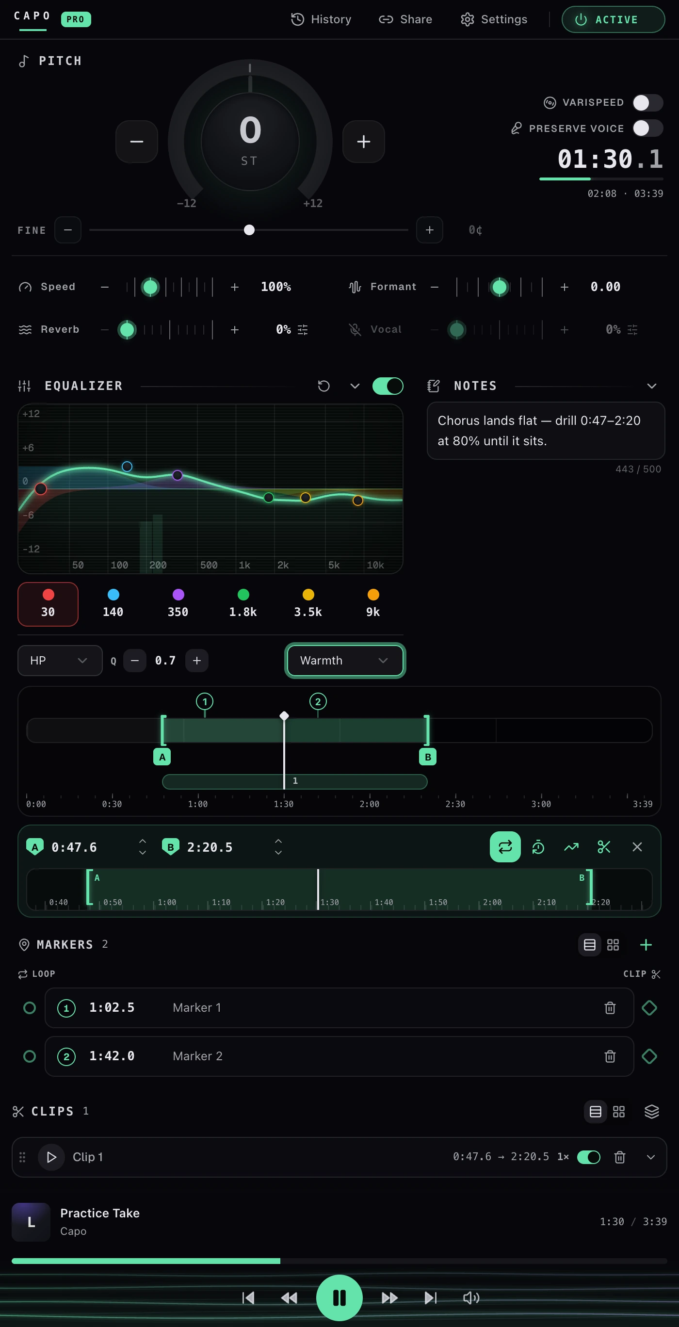
A panel can be dragged narrow, so the same modules have to hold up in a single column at roughly half the width — the same container-query layout doing the work, not a separate mobile build.
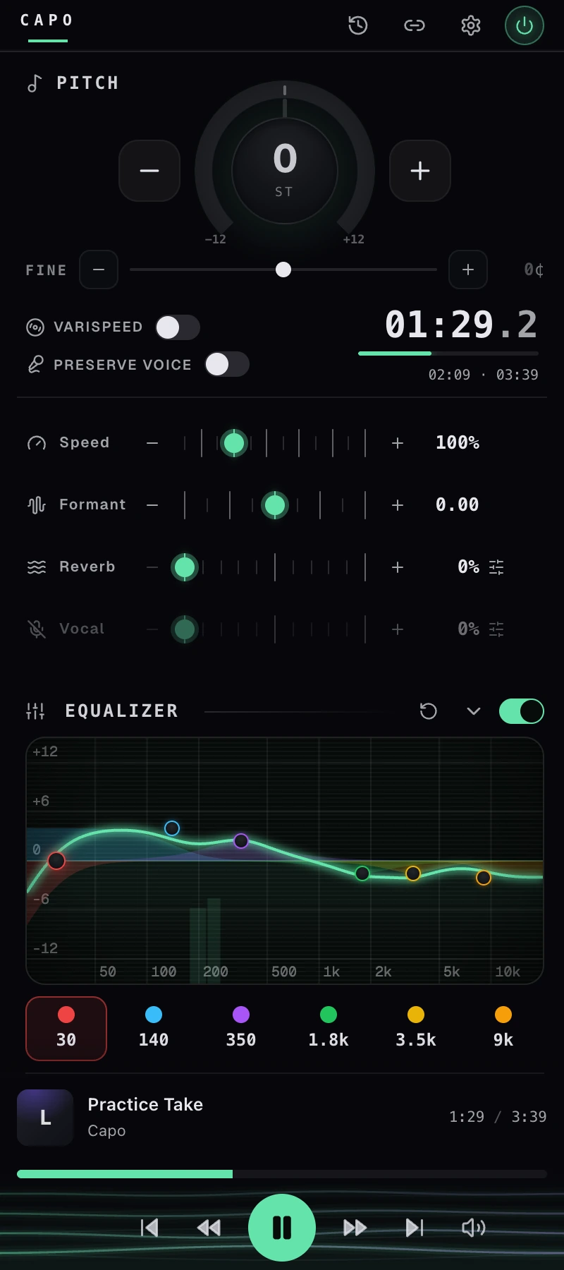
To be straightforward about status: this workspace is built and running in development, and it is not generally available yet. It is in the case study because it is the work, not because it is a launch.
Chapter 08
Testing and debugging
The testable parts of this codebase are the deterministic ones, and they are unit tested with Vitest: the tuning math that turns semitones and cents into a ratio, media identity and per-track settings recall, shortcut matching, and the state machines around entitlement and routing. A few of the trickier controls — the cents field, the tick slider — are tested at the component level as well. Those are the places where a silent regression would be expensive and invisible.
What cannot be usefully unit tested is the part that only exists inside a real browser: patched globals, an audio graph, a worklet, and a page that is fighting you. That gets verified by hand against real sites, in more than one frame, across single-page navigations.
The real difficulty is that a bug can live in any of four contexts — the popup, the background service worker, the isolated-world bridge, or the main-world engine — and each has its own console. Working that out taught me to make the boundaries between them typed and explicit, so the question "where did this value stop being right?" has a small number of possible answers instead of an unbounded one.
Chapter 09
Release and maintenance
Releases are automated: a push to the main branch bumps the version, builds the extension, and submits it to the store, so shipping is not a manual checklist someone can get wrong at 11pm.
What automation cannot fix is review latency. An extension update is not live when you push it — it is live when it clears review. You cannot hotfix your way out of a bad build, which changes how you work: it makes you conservative about what goes in a release, and it makes the states that fail gracefully more valuable than the features that only work when everything is right.
Capo is on the Chrome Web Store, has been through many versions since it launched, and I still maintain it. I am not going to quote install counts or ratings here, because the point I want to make is a different one: it shipped, it is still shipped, and it still gets updates.
Chapter 10
Engineering takeaways
Five things I would take to the next product, all of them specific to having built this one.
- On someone else’s page you are a guest. Patching global constructors works, but it obliges you to be cheap, reversible, and completely out of the path when you are switched off. Bypassing by rewiring the graph rather than flagging inside the processor is the version of that I would write again.
- A small canvas is a design gift. Three hundred pixels made it impossible to avoid deciding what mattered. Every interface I have built since with more room has been harder to keep honest.
- Choose the unit your user thinks in. Semitones and cents, not ratios and percentages. The audio engine works in ratios; that is the engine’s problem, and it should stay there.
- Latency is part of the interface. A fader that visibly lags the sound reads as broken even when the value is right, so the control path from gesture to audio parameter has to be short — which shaped the messaging design more than any feature did.
- Shipping is the feature. The store release, the empty states, the shortcut scopes, the fifty languages, the automated release — none of them are the interesting engineering, and all of them are the difference between a demo and a product.